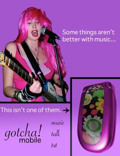

I would like to simply make the ads a little more age-appropriate through the use of contrasting line colors. For example, green lines on the red background, and so on. The black lines are a sort of sophisticated and older style. After doing this, I think our ads will be more appealing to our target market.
These were very enjoyable and comical ads to look at! I completely agree about the line coloring. Brighter colors attract the young viewer's eye and that's what you are aiming towards for this particular campaign. I really like how you guys used the comical approach to this campaign and brought about the fact that this phone can play music as well. I agree that the style you used is very sophisticated and you might want to tone that down some since this is an ad for ages 9-12. But other than that, I think that this campaign was consistent and that you did a good job of keeping it that way. I liked your ad with the monkey on it the best because it is cute and hilarious. I liked how bright and colorful the ads were for all of them. I love the font you used for the "Gotcha! mobile" logo because it looks fancy and appealing. I think that you all did a really good job on this and I really enjoyed your idea of making it comedic and centered around the fact that the phone is an MP3 player as well.
ReplyDeleteI really liked the ads. You were dead on the with colors for the lines. They really needed to be more brighter to catch people's eyes. I liked the girl's ad alot more than anyone else. I thought it was effective but that's what I think. Good job with the others though.
ReplyDeleteI like the idea of using the lines to section off your ad. The color sceme you used was spot on making them appeal to the targeted audiences. I agree with making the decision to change the colors of the lines. I think this adjustment will make a positive impact on your ad.
ReplyDeleteI feel that all of your ads are very "child friendly". The images seem as if they would attract children. I can agree that the black lines can be a different color to appear more playful; However, you should pick the color carefully.
ReplyDelete